Just as a book or film can be "read" and interpreted, images can be read and analyzed. This idea is called visual rhetoric and is an examination of what meaningful information an image communicates to a viewer. Any image can be analyzed in this way, whether its a painting, photograph, sketch, or advertisement. Note that an image is not a graphic: graphics represent data graphically in charts or graphics, but are informational and not artistic in their aesthetic. There are two main categories of visual rhetoric: image composition (what is in the image) and image context (how the image is produced and received).
Image composition
Image composition refers to all the elements in the image and is self-contained. Image composition uses objective observations about the art and then makes arguments about how a viewer "reads" a painting based on these observations. Here are the elements of composition.
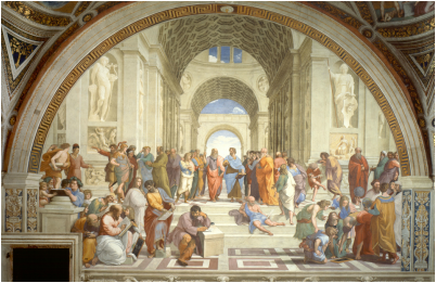
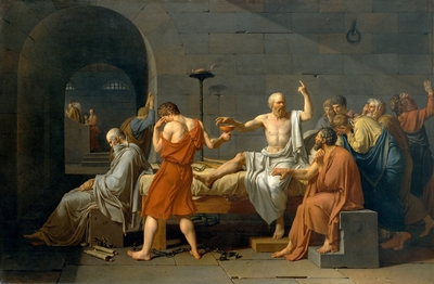
SUBJECT: Just like the subject of a story or essay, images have subjects: the who or what is depicted. The subject could be a single person, a group of people, or even an inanimate object. Just as in a story, there can be a main subject the eye is supposed to focus upon and supporting subjects. Below, in The School of Athens, all the philosophers are of equal stature of weight, even though Raphael puts some toward the center. However, The Death of Socrates centers around Socrates, who is easily identifiable by his central location, lighter robe, and activity.
ACTIVITY: Activity involves the interplay of people and objects and has two elements: What each person (or object) is doing and each person is looking at. Notice in The Death of Socrates what each person is doing: Socrates in white is about to take his cup of poisoned hemlock in one hand while talking to his acolytes, his right hand gesturing upward (not coincidentally in the same way Plato's does in The School of Athens). We can tell his is lecturing to him because he is talking and looking at them, while almost all are looking back at him. We know the cup-bearing executioner in red is ashamed of what he is doing, as he cannot look at Socrates. Plato, at the foot of the bed, is sitting and lost in thought. Behind Plato in the hallway is a woman crying: this is Socrates' wife. By having his wife led away from him while his followers stay, the painting makes a statement about the importance of relationship in Socrates' life.
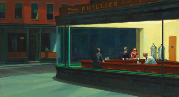
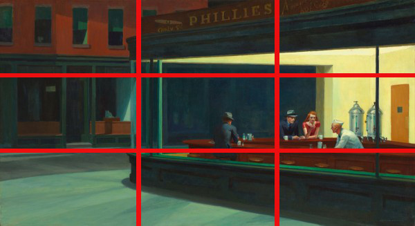
Now look at Nighthawks below. The man behind the counter has is mouth open and is looking at the man in the blue suit, who is looking at him; it's clear they are in conversation, with the man behind the counter reaching under the counter to get something for the man. The man in the blue suit has a cigarette in his hand, but it is not yet lit. The woman in red next to him is holding a matchbook in her left hand and looks at it; the fact that she is close to the man (her left hand on the counter almost touches the man) and that she has the matches for the blue man's cigarette shows that they have some sort of relationship. The other man, whose back is to the viewer, is staring down at his glass and far from the others. This man is not involved with the activity of the others but is focused on his own life. Finally, despite this being a downtown diner, there is no other activity outside in a city--not even a light or car. This lack of other activity makes the whole scene eerie and unsettling.
Now look at Nighthawks below. The man behind the counter has is mouth open and is looking at the man in the blue suit, who is looking at him; it's clear they are in conversation, with the man behind the counter reaching under the counter to get something for the man. The man in the blue suit has a cigarette in his hand, but it is not yet lit. The woman in red next to him is holding a matchbook in her left hand and looks at it; the fact that she is close to the man (her left hand on the counter almost touches the man) and that she has the matches for the blue man's cigarette shows that they have some sort of relationship. The other man, whose back is to the viewer, is staring down at his glass and far from the others. This man is not involved with the activity of the others but is focused on his own life. Finally, despite this being a downtown diner, there is no other activity outside in a city--not even a light or car. This lack of other activity makes the whole scene eerie and unsettling.
PERSPECTIVE: In art, the perspective of the viewer is crucial. Like a literary perspective, artistic perspective is the point of view from which the viewer sees the scene. In Nighthawks, the painting is viewed as if the viewer is across the street at eye level. Other paintings can look down upon a subject (this is called a bird's eye view) or at a subject from down below (this is called a worm's eye view).
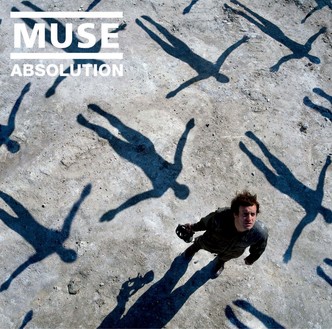
In addition to looking down onto a subject or up at a subject, perspective also addresses where subjects are placed. If a subject is placed in the dead center of an image, it feels a bit flat and uninteresting, so there are several patterns of arrangement that artists use to make the images more interesting: the rule of thirds, the vanishing point, and the golden spiral. The rule of thirds essentially states that dividing the canvas into thirds vertically and horizontally will result in four line intersections, and subjects should be as close to those intersections as possible. The subject in the Muse album is clearly in one of these intersection, as is the center of Dylan's body (this is why we see all of his right arm but not all of his left. Look again at Nighthawks below: notice the diner wall, counter, and street follow the third lines, and a line divides the lonely man from the other three to reinforce his isolation.
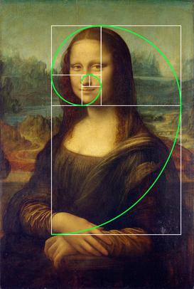
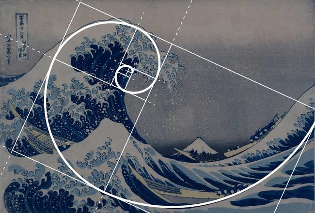
The golden ratio is another common, though more complex, pattern in images. The golden ratio is formed by taking a rectangle and dividing it into two parts so that the longer part divided by the smaller part is also equal to the whole length divided by the longer part (a/b = a+b/a). The idea behind the golden ratio is that it makes distances between subjects or other point more pleasing to the eye. Artists take this ratio and keep subdividing the rectangle, often forming a spiral.
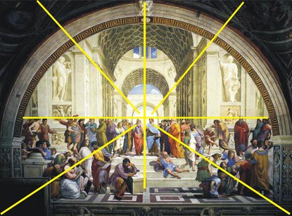
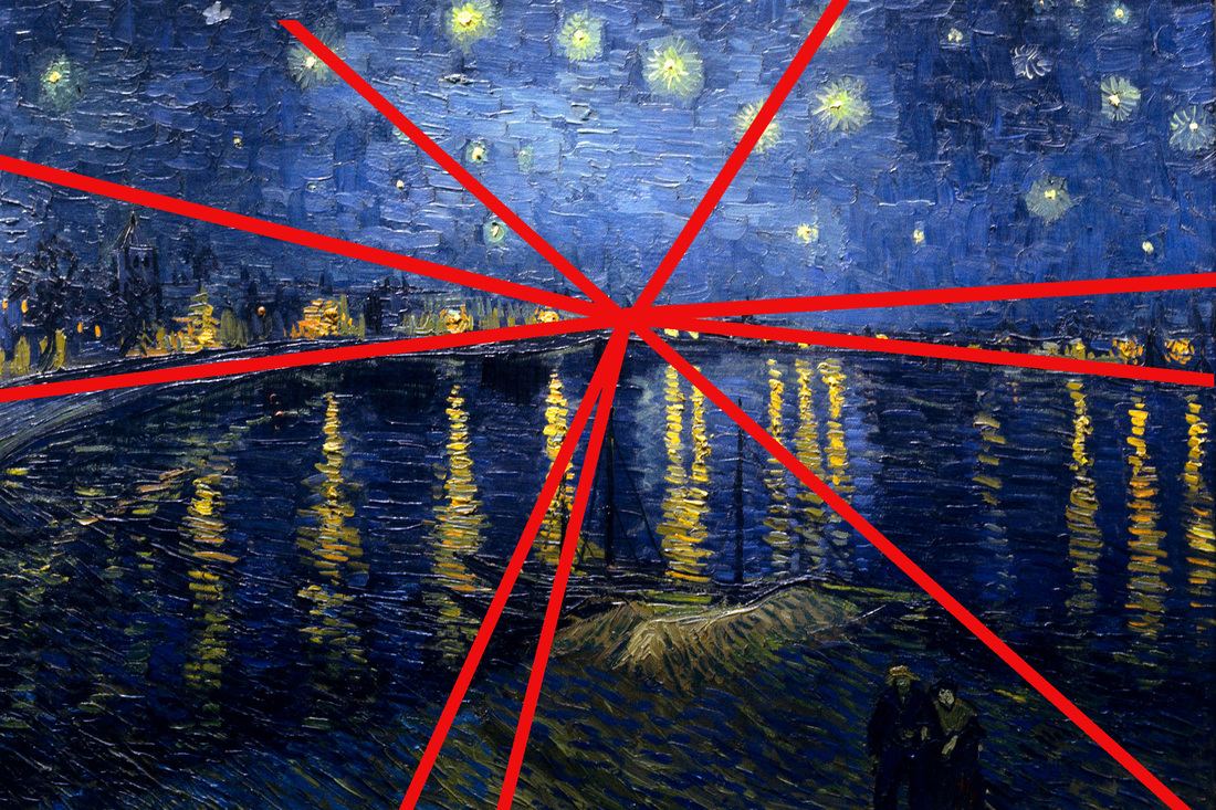
Finally, images can have a vanishing point, which is a spot in the image (usually at the center) where all the parallel lines of an image converge off in the distance. The vanishing point is popular in landscape photography and Renaissance paintings. Take another look at The School of Athens: all the angles of the piece converge at the space right above the heads of Plato and Aristotle through the center arch. The same effect can be seen in Vincent Van Gogh's Starry Night Over the Rhone. This aesthetic is sometimes called one-point perspective.
GRAPHIC WEIGHT: Graphic weight is the way some images attract the eye more than others do. Illustrators do this through placing images in the foreground rather than the background, using of dark-toned images against light-toned images, using patterns to lead the eye, and using colors that are more brilliant or deeper than others on the page. Where a person or an object is placed in a painting is always intentional and important. Whatever is in the center of the painting is very important, as this is where the eye goes first. Look again at The Death of Socrates: at the very center of the painting is a cup of poison, which will be the literal death of Socrates. The eye naturally follows to Socrates himself before the executioner, as he is surrounded by more people. The eye then leads back to the executioner and then to Plato, who is looking away. Behind Plato is an arch with figures in the distance, which is the only part of the painting that has depth.
In photography, the effect that is seen in the arch behind Plato is called depth of field. Depth of field is the distance between the nearest and the furthest subjects to the camera; since a camera lens can shift focus, either the background, midground, or foreground becomes blurry depending on the depth of field. Depth of field establishes which subject is the focus of the photograph.
In photography, the effect that is seen in the arch behind Plato is called depth of field. Depth of field is the distance between the nearest and the furthest subjects to the camera; since a camera lens can shift focus, either the background, midground, or foreground becomes blurry depending on the depth of field. Depth of field establishes which subject is the focus of the photograph.
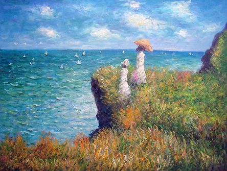
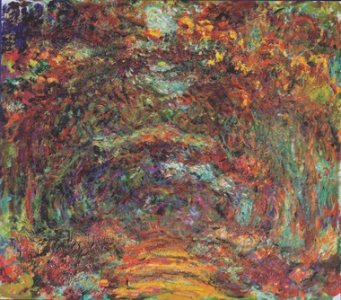
Color can also create graphic weight. In The Death of Socrates, Socrates is dressed in white, making him brighter than the other characters; the executioner is dressed in red, which also makes him stand out and is the color of blood; and Plato wears grey, allowing him to blend into the background and not be noticed, which is his intention as he is not facing the action. Choice of a color palette can be just as important: Picasso was famous for his rose and blue periods, when he painted primarily with those colors. Occasionally, color choice is incidental to artist choice and caused by artist's flawed eyesight. Monet developed cataracts later in life, which shifted his perception of color toward reds and yellows as he could no longer distinguish blues, greens, or whites.
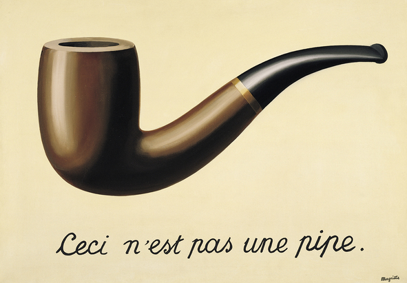
TEXT: When text appears in an image, it also has to be analyzed for the message it carries, its relative size, its color, and its font. While this is mainly a feature for advertisements and album covers, which use text as a way to sell a product, many modern artworks also carry texts. A great example is Rene Magritte's The Treachery of Images (below), which depicts a painting of a pipe and the words "Ceci n'est pas une pipe" ["This is not a pipe"]. The text is black and in cursive, giving the text a classic yet elegant style. The words are directly below the pipe and span almost its entire length, making the words a label to the image. The text is meant to get the reader questioning the symbolic nature of art: while the painting clearly depicts a pipe, by reminding the viewer that it is not a pipe but only a painting, Magritte causes the viewer to question not only what they are looking at (if it's not a pipe, what is it?) but what constitutes a true pipe (Appearance? The ability to smoke from it? The proper label?)
Image context
PURPOSE: Just like any other texts, images have a purpose: to entertain, to inspire, to warn, to convince, or to anger. Sometimes, the purpose of an image is very direct: advertisements, for example, want the viewer to buy the product. Yet even ads can have a secondary artistic purpose and can have higher meaning. Interpret purpose just like you would for another text; identifying the artistic movement and audience can help you figure out the purpose.
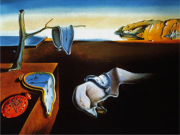
MOVEMENT: Just as literature falls into a certain literary movement with certain themes and tropes, artworks often fall into an artistic movement (many of which, like renaissance and modernism, crossover with literary movements). When writing about an art image, consider how the artist either conforms to or breaks away from the movements popular at the time. For example, the image below is Salvador Dali's The Persistence of Memory. Dali finished the painting in 1931 and was a member of modernism, specifically surrealism. As the modernists were trying to question the nature of existence, Dali uses this painting to question the nature of time by depicting melting clocks-- the literal blending and destruction of time. Dali also calls his painting The Persistence of Memory, which intimates that the painting is how memory lasts and persists. With clocks representing time and the clocks melting, Dali seems to suggest that over time, memories start to dissolve, blend into one another, and distort. The painting makes readers question the validity of their own memories, for how can a person define their reality if they cannot rely on their own memories to be accurate? By identifying Dali's painting as part of the surrealist artistic movement, it becomes easier to identify the theme of the painting. While advertisements don't necessarily follow artistic movements, they do have certain trends and movements as well.
AUDIENCE: All images are made for a certain audience just like literature, yet audience has a more direct effect on images. Traditional art is made not only for expression, but also for profit and notoriety. Internet images are more geared toward mass exposure and scalability (so an image looks excellent on screens large as a television to small as a cell phone). Advertisements are very careful in addressing a specific audience: for example, cereal boxes feature colorful cartoon mascots that look downward: to children, these cartoon characters appeal to them not only by being bright and fun, but by looking them directly in the eye. Advertisements also have other audience considerations: text must be able to be seen from far away and images should be able to fit into a larger campaign of complementary images and varied sizes.
Analyzing an image
First, describe what is literally depicted. Objectively, describe the subjects depicted, the relationship of all the elements together (including perspective terminology), and any action depicted. Describe the colors used and everything in the foreground middle, and background, including graphic weight of each element. Describe the type of medium (photograph, painting, digitally constructed, etc) and the movement it fits within, if applicable.
Next, justify the choices of each of the literal items depicted. Why did the artist choose this subject to depict? Why does the artist give stronger graphic weight to one item over another? Where does the artist choose to use the rule of thirds or a vanishing point? What is the meaning of the colors used? Why did the artist choose to create the image in the way they did (i.e., why paint an abstract landscape with oil instead of taking a photograph?)
Next, describe the purpose of the image. What was it created to express? Who is the intended audience of the image, and what do other audiences see in it (i.e., critical lenses)? How does the image fit inside a movement, and hoe does this inform the purpose? Also include, if applicable, the history of a piece: How was it received when it came out? How has it influenced other artists? What did the original artist have to say about it?
Finally, critique the image. Did the artist make effective choices in style and content? Is the image clear? Does it achieve its purpose?
How to caption and cite an image
When captioning an image in a written essay, the caption is in the same font as the rest of the page, only 2-3 sizes smaller. Any description of the image should be written as a full sentence with a period, with the image information in parentheses. For famous paintings, cite the name of the artist, the title of the painting, and the year; you do not have to cite these in the works cited. For other images, just site the artist name, and cite the full information in the works or images used. The caption should never be wider than the image. You do not have to cite original images. Here are two examples:
As far as in-text citation, just cite the artist. Citations for physical images consist of the artist, the name of the piece in italics, the location of the original piece, and year created. If you need to cite a digital version of a physical art piece, add the website name, date posted, and URL. If citing a digital-only artwork, cite the artist, the name of the piece in quotes, the name of the website, the date posted or accessed, and the URL. You do not need to cite your original artwork, though you should title it. Look at the works for this page cited below to help guide you.
Images Used
Aroch, Guy and Nacho Ricci. "Taste the Feeling" Ad Campaign. Coca Cola, January 2016.
Da Vinci, Leonardo. Mona Lisa. The Lovre, c. 1517.
Dali, Salvador. The Persistence of Memory. The Museum of Modern Art, 1931.
David, Jacques Louis. The Death of Socrates. The Metropolitan Museum of Art, 1787.
Dylan, Bob. Nashville Skyline, with cover art by Elliot Landy. Colombia, 1969.
Gomez, Patricia. "Golden Ratio." Wordpress, 20 January 2016, patriciasdesignsite.wordpress.com/2015/01/20/golden-ratio.
Hokusai. The Great Wave off Kanagawa. Private collection, 1832.
Hopper, Edward. Nighthawks. Art Institute of Chicago, 1942.
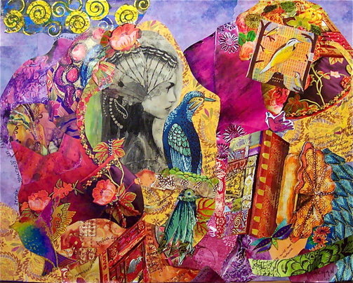
KanchanCollage. "Joan of Arc." DeviantArt, 16 June 2010, fav.me/d2ryc6x.
Krek. "Nao Falar a Verdade, e Mentir?" Wordpress, 19 May 2008, wp.me/pheU5-cF.
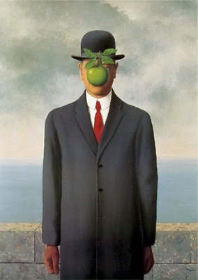
Magritte, Rene. The Son of Man. Private collection, 1964.
- - -. The Treachery of Images. Los Angeles County Museum of Art, 1929.
Monet, Claude. The Cliff Walks at Pourville. The Art Institute of Chicago, 1882.
- - -. The Rose Walk, Giverny. Musee Marmottan Monet, 1922.
Muse. Absolution, with cover art by Strom Thorgerson. Taste Media, 2003.
ntmw. "Pool Balls - Gritty 1" Getty Images, accessed 1 July 2016, istockphoto.com/article_view.php?ID=109.
Quaker Oats. The Cap'n Crunch cereal box front. Mass produced, photographed 4 July 2016.
Raphael. The School of Athens. The Apostolic Palace, 1511.
Sutton, Zach. "Why I Crop My Headshot Photography the Way I Do." Zach Sutton Photography, 29 April 2015, zsuttonphoto.com/crop-headshot-photography-way
Terry, Todd. "Focus on Controlling Depth of Field with Depth of Field Converters." CreativeCOW, accessed 1 July 2016, library.creativecow.net/terry_todd/depth_of_field_converters/1
Van Gogh, Vincent. Starry Night Over the Rhone. Musee d'Orsay, 1888.
