Graphic literature is any literature where the storytelling is interwoven with key images. Graphic literature includes children's picture books, comic, graphic novels, web comics, and even some video games. Graphic literature does NOT include literature with supplemental illustrations or informational texts with pictures and graphs-- if the images can be removed and the story remain unchanged, then it is not graphic literature.
Storytelling in graphic literature
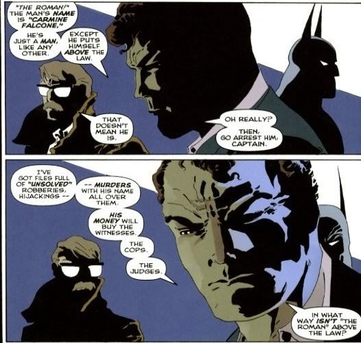
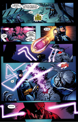
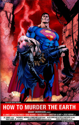
Storytelling is the same as a narrative text, and uses character development, plot events, themes, motifs, symbols, and archetypes. However, some of these elements are expressed through the images rather that text, making it also akin to drama. For example, a novel might foreshadow that a character will become a villain through words they say or thoughts about them expressed by other characters, while graphic literature can also do this:
Style of graphic literature
As you can see, where graphic literature departs from other narratives is its artistic style. Where a book's story solely depends on the strength of its words, everything about a graphic novel informs author purpose and story meaning, from the colors used to the paper its printed on. The graphic imagery has four elements that affect its style: Composition, art design, panel division, and graphic weight.
COMPOSITION: Composition is the weight, feel, and look of the printing material. Unlike books, which are usually printed on stock pulp, graphic literature intentionally varies in page composition. Graphic literature on newsprint gives a different impression than literature printed on glossy pages. Typically, heavier paper is meant to invoke heavier subject matter.
ART DESIGN: There are three types of art design in graphic literature: iconic, realistic, and abstract
|
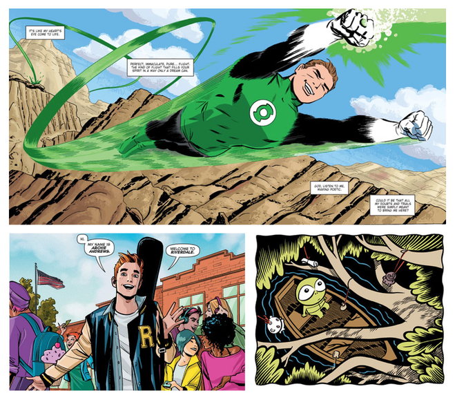
Iconic art features typical “cartoon” artwork with little detail and some exaggerated features. Think superhero comics and newspaper strips. Not every character will look exactly like they would in real life, as elements are stripped down and simplified, but characters and backgrounds look relatively normal. Animals can be characters in iconic art -- think Snoopy in Peanuts, Hobbes in Calvin and Hobbes, and every Looney Tunes character. What defines iconic imagery is that the human characters are stripped of fine detail but generally look human. Iconic art is used in most comics, as it can evoke nostalgia from the reader, is quicker to draw, and easier to read.
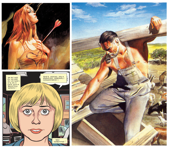
Realistic art attempt to make art as accurate to real life as possible. The key here is detail: there are no empty spaces in panels and characters have the fine detail of wrinkles, clothing seams, and individual hairs. While many comic covers are realistic, few comics themselves are realistic because of the time it takes to realistically render. Some graphic literature uses actual photos, which obviously falls into this category. Realistic comics are often historical or science fiction, giving warnings or opinions on real-world social issues.
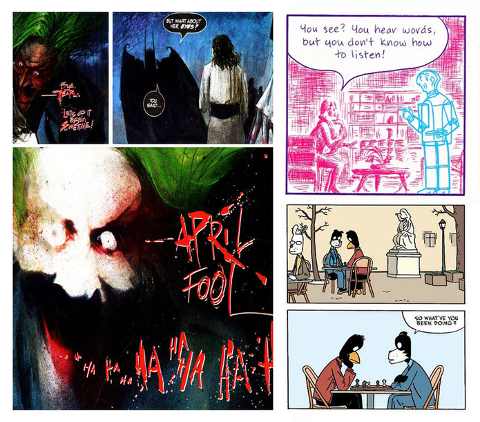
Abstract art portrays wholly unrealistic images. While iconic and even realistic art can show superheroes and talking animals that don't exist in the real world, they still try to ground the art in our reality. Abstract art is intentionally surreal, creating worlds where humans are rendered with blurry scratchy lines and don't look human, or where humans don't exist at all and characters are all anthropomorphic animals. Abstract art is used when writers want to tell a more psychologically based story.
|
PANEL DIVISIONS: A page of graphic literature is divided into sections called panels, which are distinct segment of the comic containing a combination of image and text. A panel usually includes a frame (the lines and borders that contain the panels) and gutters (the space, usually white, between panels). If an image continues past a frame into the gutter or even off the page, this is called a bleed image. A page that is all image and no panels is called a splash page.
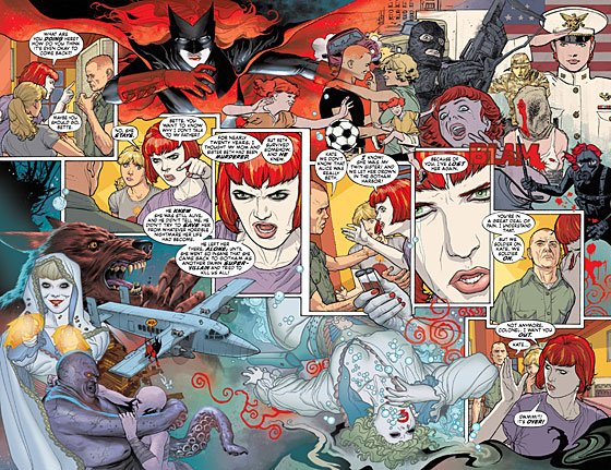
Western comics start at the top let corner of the left page and are read across, and then down (Eastern comics go right to left). Consistent framing (typically eight frames a page) creates a steady consistent pace for a reader. However, the number of panels and arrangement of panels can create different reading experiences. Look at the two examples below.
The top spread features an argument between between main character Kate Kane and her father on whether or not she and her cousin should continue her superheroics as Batwoman against Alice, a dangerous villain. The conversation continues in the diagonal across the page, splitting the page in two. Artist J.H. Williams uses the bleed in the top right of the page to visual show highlights of Batwoman's history to readers and the bottom left to show Alice's history. The way the panels are arranged allows these backstories to be present without disrupting the main action of the panel.
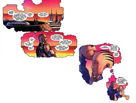
The bottom spread does the exact opposite. Instead of filling the bleed with detail, the bleed overpowers the spread. Thought the text moves in the same direction as the first spread, the shape of the frame and emptiness gives the sense that everything is dissolving, which is appropriate as the two characters are discussing the end of their world.
The bottom spread does the exact opposite. Instead of filling the bleed with detail, the bleed overpowers the spread. Thought the text moves in the same direction as the first spread, the shape of the frame and emptiness gives the sense that everything is dissolving, which is appropriate as the two characters are discussing the end of their world.
GRAPHIC WEIGHT: Graphic weight is the way some images attract the eye more than others do. Illustrators do this through placing images in the foreground rather than the background, using of dark-toned images against light-toned images, using patterns to lead the eye, and using colors that are more brilliant or deeper than others on the page.
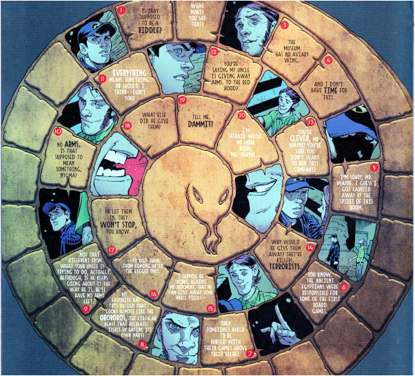
Let's examine graphic weight. In the spread above, Bruce Wayne talks to Edward Nygma, the Riddler. The text boxes rotate in a spiral pattern, giving the effect of Bruce being drawn down into a trap. The color of the background ouroboros is neutral, which causes the colorful panels of the conversation to pop. Notice that instead of distracting word balloons, which usually show who is talking, the text has different colors: black for Bruce and white for Riddler. Finally, the center of the ouroboros is lighter than the sides, drawing the eye inward.
Analyzing a graphic novel
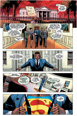
First, who are the characters? What are their motivations and how do we know them? How are characters and their relationships established visually-- through height, beauty, stature, and prominence in panel. For example, consider Clark Kent in every Superman comic: he slouches and stumbles around to protect the fact that he is secretly Superman to keep his adopted family and friends from harm. He is a contrast to both his alter ego and Lois Lane, who stands tall and acts decisive.
Next, describe the structure of the story. How do events unfold? Does the story make use of foreshadowing and backstory? Remember the Batman example at the top of the page: artwork is incredibly important at establishing this. How does the story end?
Look at the theme of the story. How do actions and character decisions support the theme of the story? Furthermore, how does the art style support the theme? Are there any visual or character archetypes that support the theme? In the graphic weight panel, for example, the background is a snake, an archetype of deceit, which supports the theme of the issue that the Riddler is trying to deceive Bruce. Make sure to mention color, even if there is none; Maus, for example, is in black and white to invoke actual Holocaust photos and to make the story very stark.
Next, discuss style. What is the tone, and how does the art reflect the author's attitude? As far as imagery, describe the use of paneling and use of bleed images and splash pages. Describe how color is used, including the color palette (and don’t forget the gutter color-- black gutters, for example, indicate a darker story). Is there a narrator and, if so, who is it? What sort of word choice does the narrator use? Is there a lot of use of dialogue, or is the story mostly visual?
Finally, critique the medium. Why did the author choose the graphic novel structure over others to tell his or her story? How is the story told differently than it would be as regular prose? Was making this a graphic novel an effective choice? This may seem obvious of superhero stories, but even those could be developed into films or web series instead of print comics.
How to quote and cite a graphic novel
Block quote a graphic novel just as you would quote a play: with character names in all caps, followed by a colon, followed by a line. Do not divide lines by panel-- if a speaker is still speaking, keep going. If significant action happens in the selection, describe it using brackets on its own line. Remember to distinguish between a character's inner narration and dialogue. Here is an example:
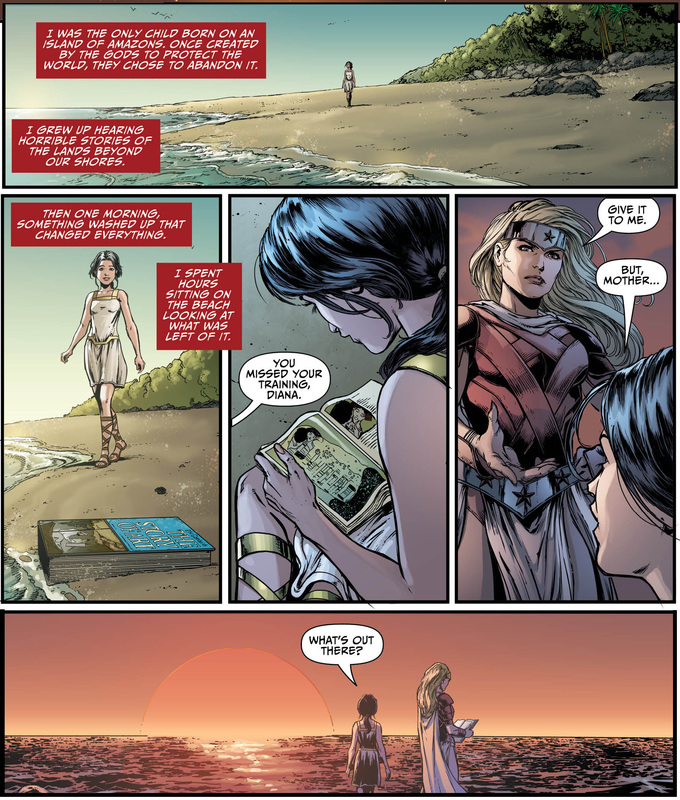
WONDER WOMAN (narration): I was the only child born on an island of Amazons. Once created by the gods to protect the world, they chose to abandon it. I grew up hearing horrible stories of the lands beyond our shores. Then one morning, something washed up that changed everything.
[Young Wonder Woman finds a book titled The Story of Art on the beach.]
WONDER WOMAN (narration): I spent hours sitting on the beach looking at what was left of it.
HIPPOLYTA: You missed your training, Diana. [sees book] Give it to me.
YOUNG DIANA: But Mother... [looks out to the ocean] what's out there?
As far as in-text citation, cite the author and artist and page. If your comic is only a single page, cite which panel you used. Citations consist of the write and artist (et al. if more than one artist), the name of the book, original publication date, publisher, and year. If a single issue of the comic is used, also cite the issue title and month of release. Look at the works for this page cited below to help guide you.
Images Used
Blackman, W. Haden and J.H. Williams III. "Hydrology, Part One: Leaching." Batwoman, vol. 2, no. 1. DC Comics, September 2011.
Clowes, Daniel. Mister Wonderful. Pantheon, 2011.
Cooke, Darwin. DC: The New Frontier, vol. 2. DC Comics, 2004.
Jason. Werewolves of Montpellier. Fantagraphics, 2010.
Johns, Geoff and Jason Fabok. "Darkseid War, Chapter One: God vs. Man." Justice League, no. 41. DC Comics, August 2015.
Loeb, Jeff and Tim Sale. Batman: The Long Halloween (1998). DC Comics, 2007.
Mazzucchelli, David. Asterios Polyp. Pantheon, 2009.
Morrison, Grant and Dave McKean. Arkham Asylum: A Serious House on Serious Earth (1989). DC Comics, 2004.
Snyder, Scott, and Greg Capullo. "Zero Year: Secret, Part Two." Batman, vol. 2, no. 22. DC Comics, September 2013.
Thompson, Craig. Goodbye, Chunky Rice (1999). Pantheon, 2004.
Waid, Mark and Alex Ross. Kingdom Come. DC Comics, 2007.
Waid, Mark and Fiona Staples. "Welcome to Riverdale." Archie, vol. 2, no. 1. Archie Comics, September 2015.
Vaughan, Brian K., and Pia Guerra. "Whys and Wherefores, Part Three" (September 2007). Y: The Last Man, Deluxe Ed., vol. 5. DC Comics, 2011.
